
Modern posters have moved far beyond dorm-room decor. In today’s interiors, they act as focal points, mood setters, and flexible design tools that can transform a room without the cost or permanence of a full renovation. Recent interior design coverage points to a clear shift away from sterile minimalism toward spaces with richer color, layered personality, and more expressive walls. Posters fit that shift perfectly: they are graphic, adaptable, and surprisingly sophisticated when styled with intention.
Why Modern Posters Feel Especially Relevant Right Now
One of the strongest currents in contemporary decor is the move toward homes that feel more personal and emotionally resonant. Designers have been embracing color drenching, moody palettes, and livable luxury rather than all-white, overly restrained spaces. Posters work beautifully in this context because they can introduce color, rhythm, and narrative in a lightweight way. A single bold print can anchor a reading corner, while a carefully planned gallery wall can turn a blank wall into the most memorable part of the room.
They also appeal to a practical mindset. Unlike major furniture changes, poster styling is fast, affordable, and easy to refresh with the seasons. That makes it ideal for people who want interiors that evolve over time instead of staying visually frozen for years.
- Oversized Statement Posters
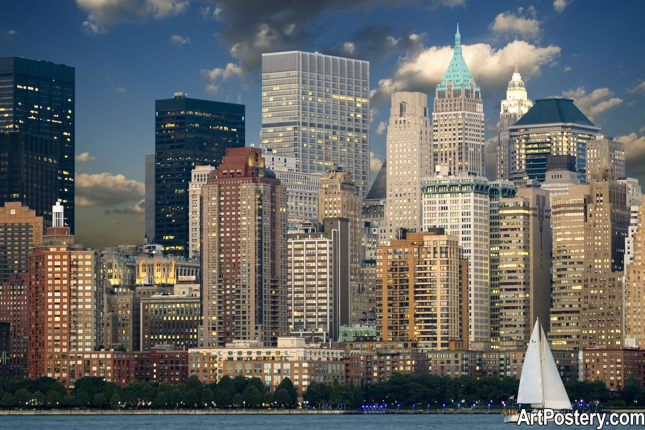
One of the clearest wall-art trends is scale. Instead of filling a wall with many small pieces, more homeowners are choosing one or two larger posters with room to breathe around them. Oversized abstract compositions, architectural photography, and graphic landscapes are especially effective in living rooms, dining areas, and entryways. They create a gallery-like presence and make a space feel more deliberate.
This approach works best when the surrounding decor is calm enough to let the artwork lead. Clean-lined furniture, textured fabrics, and simple lighting help large posters feel polished rather than chaotic.
- Typography Posters with a Design-Led Edge
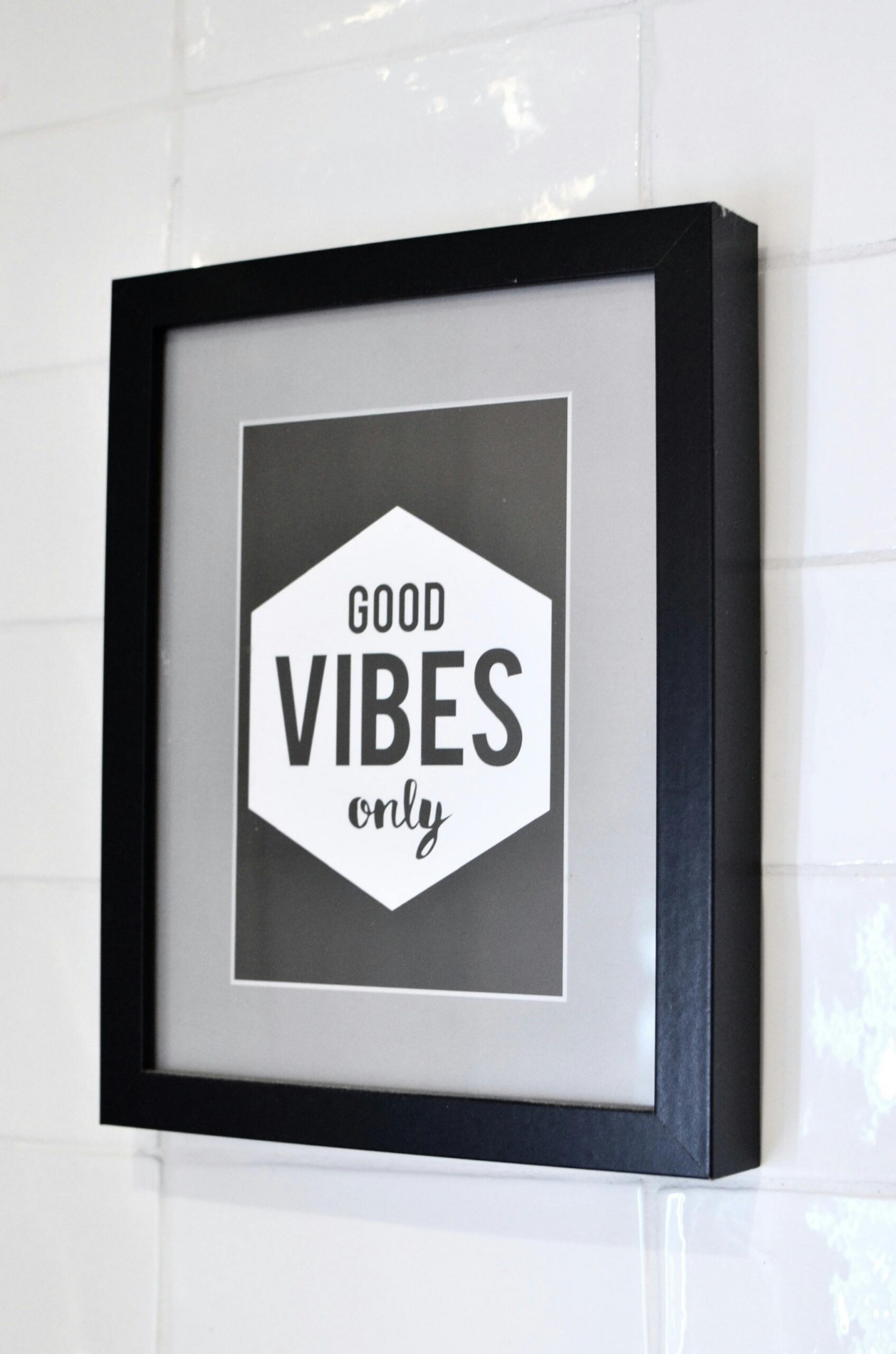
Typography posters are back, but in a more refined form. The trend is moving away from generic motivational quotes and toward bolder, more editorial compositions inspired by magazines, Swiss modernism, and exhibition graphics. Strong type, asymmetrical layouts, black-and-cream palettes, and sharp color accents can give a room instant visual confidence.
These posters are especially effective in home offices, hallways, kitchens, and contemporary bedrooms. They pair well with monochrome walls, walnut furniture, chrome accents, or color-drenched corners where the artwork echoes the room’s overall palette.
- Curated Gallery Walls Over Random Clusters
Gallery walls remain popular, but the look has matured. The strongest examples feel curated rather than accidental. Instead of mixing unrelated pieces in inconsistent frames, modern gallery walls often follow a visual system: a restrained color story, repeated frame finishes, or a consistent balance between photography, abstract work, and typography.
A useful rule is to choose one dominant thread. That could be warm neutrals, black-and-white imagery, botanical forms, or a retro-inspired palette. When there is a clear visual rhythm, even eclectic poster combinations feel elegant.
- Bold Color, But Handled with Restraint
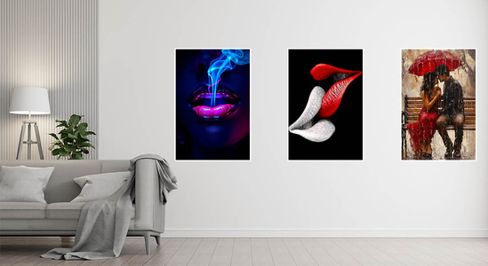
Contemporary interiors are leaning into deeper greens, burgundy, ochre, tobacco, and saturated blues. Posters are an easy way to echo those tones without repainting an entire room. A print with a rich accent color can connect cushions, ceramics, throws, and rugs into one cohesive visual story.
The trick is balance. If the room already has strong color on the walls, choose posters with structure and negative space. If the room is neutral, this is where more vibrant poster art can do the heavy lifting.
- Nostalgia, But Cleaner
Another noticeable direction in decor is the return of nostalgia: vintage references, retro palettes, music-inspired visuals, and classic art motifs reinterpreted for modern homes. In poster design, that often shows up through softened ’70s tones, grainy photography, travel-poster aesthetics, or contemporary takes on old master compositions.
What keeps the trend feeling current is editing. Instead of filling a room with overtly themed decor, designers tend to mix one or two nostalgic notes into a modern shell. That contrast is what makes the look feel intentional rather than costume-like.
How to Style Modern Posters Well
Match mood before color. Choose artwork that supports the emotional tone of the room: calm, dramatic, playful, or architectural.
Frame consistently. Even affordable posters look elevated when the framing feels deliberate.
Respect scale. Small posters can disappear on large walls unless grouped thoughtfully.
Repeat one visual cue. This could be a color, line quality, subject matter, or typographic style.
Leave breathing room. Negative space around art often makes a room feel more expensive.
The Real Appeal of Poster-Based Decor
The best modern interiors are no longer trying to look anonymous. They are trying to feel lived in, layered, and specific to the person who inhabits them. Posters support that beautifully. They let people bring in design references, favorite colors, cultural influences, and visual personality without committing to something immovable.
That is why modern posters continue to rise in relevance: they sit at the intersection of affordability, flexibility, and style. In a design landscape that values individuality more than perfection, they are no longer an accessory. They are part of the architecture of atmosphere.
